Sun Prints for Summer Solstice
I love the idea of MAKING things, creating anything, to mark a solstice. I wish I was raised by some witchy mom, aunt, grandma, or other motherly figure who would pass these traditions down, but far from it. So I always feel like when I want to celebrate the Wheel of the Year, I’m making it up as I go. If you feel like this but long to do something, maybe this will give you some easy inspiration! This year I tried out cyanotype sun prints.
What Even Is a Cyanotype?
Cyanotype is one of the oldest photographic printing processes – invented in the 1840s – and it works like this: you lay objects on light-sensitive paper, expose it to UV light (in our case, the sun), then rinse with water, and whatever was blocking the light shows up white against a deep, dreamy blue after it dries.
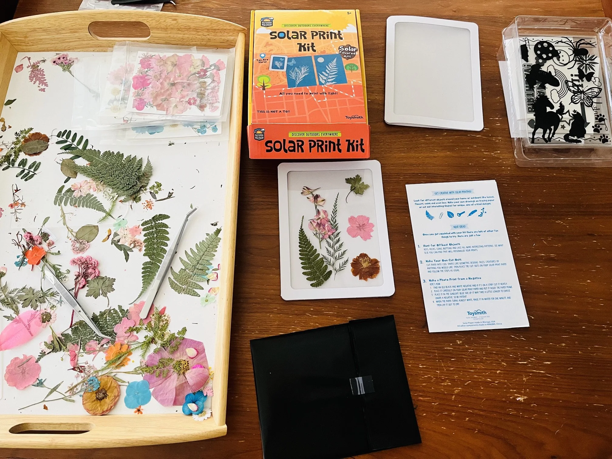
I used the Toysmith Outdoor Discovery Solar Print Kit Bundle, which is technically marketed for kids, but I don’t think that should stop anyone, it’s a good beginner friendly kit. It comes with 24 sheets of sun paper, stencils, and small frames to cover your print while exposing it to the sun.
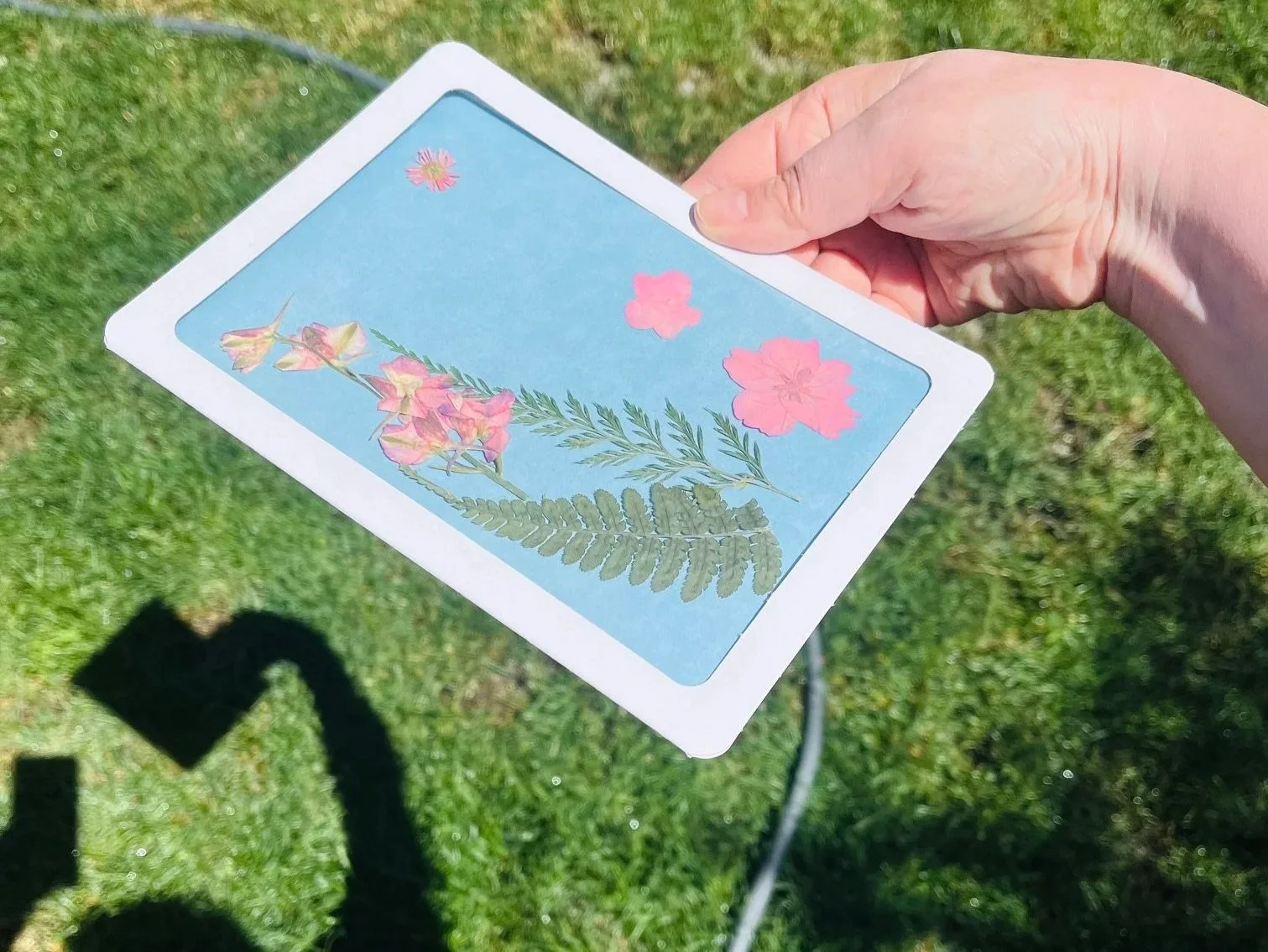
The Process (What I Did)
For objects, I ended up pulling from two sources. I had a collection of pressed flowers I’d ordered from Amazon for a completely different project (I’ve been modge podging them onto clear bookmarks) and I figured I’d try a few on the sun paper. Turns out pressed flowers are perfect for this. They’re already completely flat, the detail is incredible, and the silhouettes are exactly the kind of graphic, delicate shapes that cyanotype loves.
I also went out to the yard and grabbed a few things that looked like they’d press down easily – some flowers that were cooperative enough to lay flat under the plastic frame piece. Those worked well too, though they took a bit more fussing with to get positioned.
(This whole experiment has also inspired me to start building my own pressed flower collection. More on that another time, probably.)
I worked indoors to set up each sheet, arranging my objects how I wanted first, and then pulled out the sheet of paper to quickly transfer my arrangement onto that.
Then I carried everything out into full sun and started timing. The paper starts out a pale blue-green and gradually lightens as it exposes, so when the exposed paper is almost white, then it’s ready. On a bright summer day, I kept mine exposed for 60-70 seconds. Your results are going to be a little different probably based on time of day, cloud coverage, and if you have a kit that has one of those acrylic panels instead of the plastic frame like I had.
Then into the water to give it a gentle rinse, which clears off the chemicals that cause the paper to be light sensitive. I let everything dry flat. The image will become more clear and the blue turns deeper over the course of a few hours as it dries.
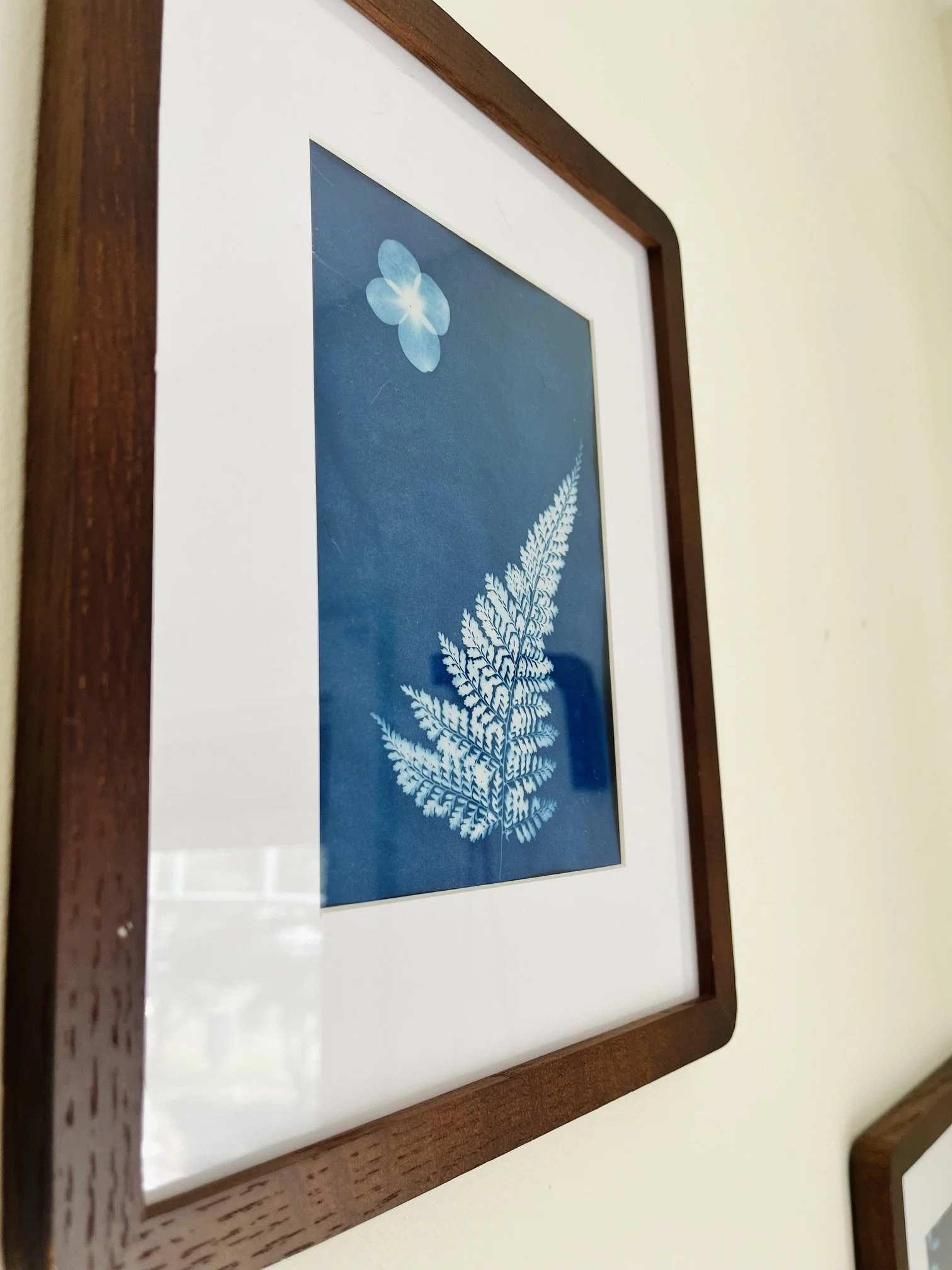
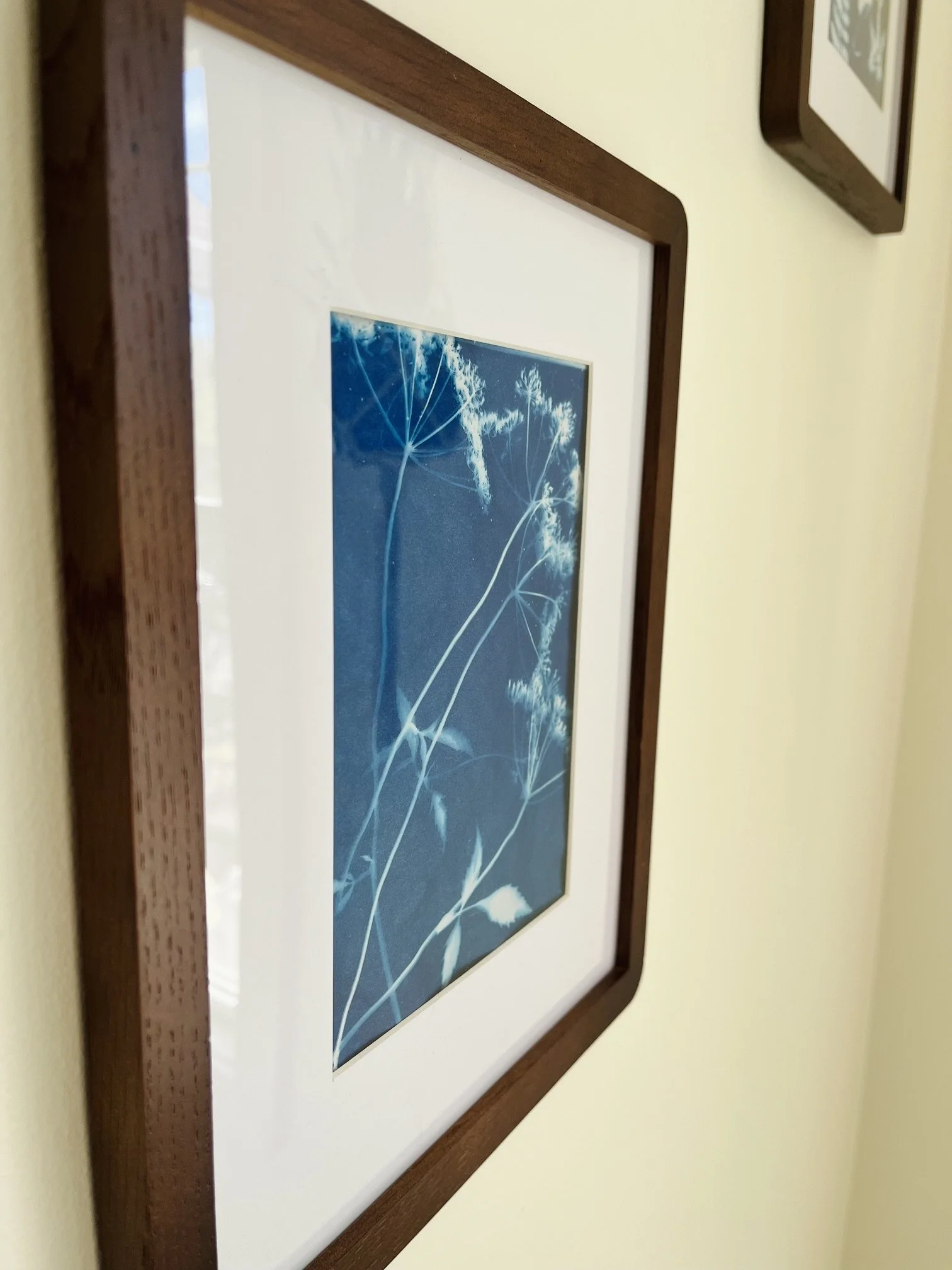
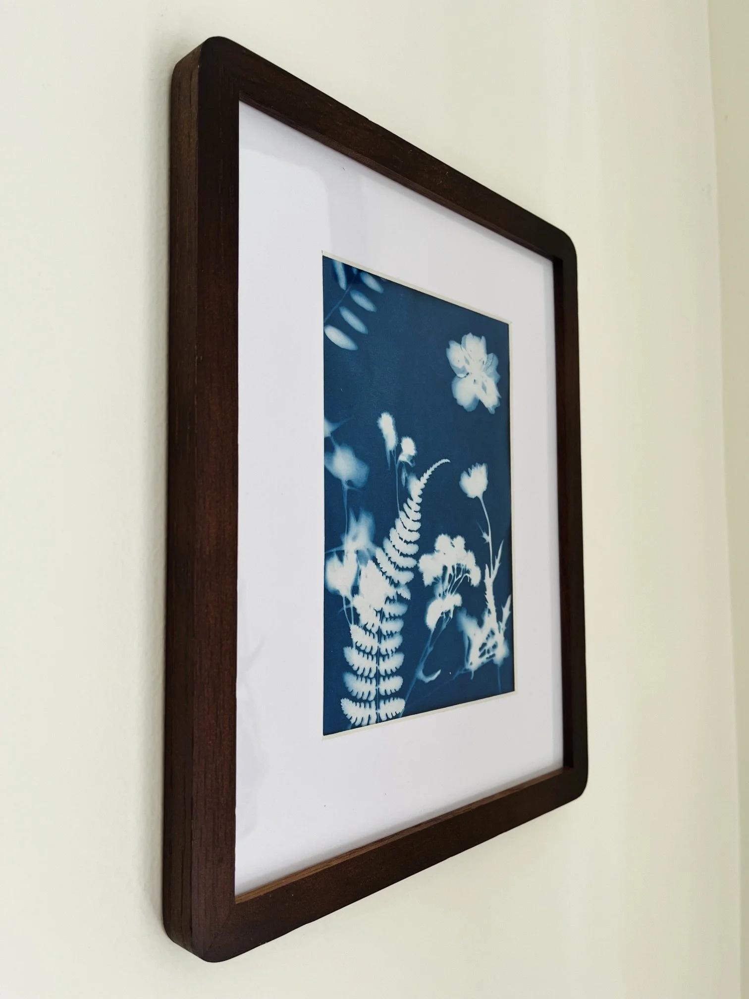
I ended up with more prints than I expected to like, but three were clear keepers. Those three are now framed and hanging on a bare space of wall that was in need of some love anyways. But also let’s be honest, there is a lot of trial and error with this, so expect quite a few failures as well! Just try to take note of what worked and what didn’t.
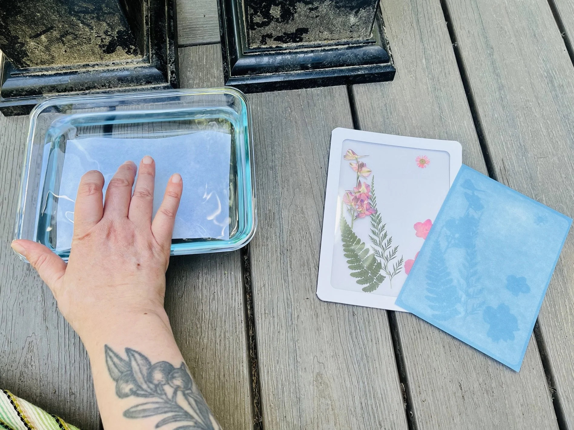
What Worked
Pressed flowers. These were perfect. Two of my three framed prints used pressed flowers, and the results were fantastic. Such nice fine petal detail, the delicate stems, the way they lay perfectly flat without any coaxing. If you have pressed flowers on hand (or want an excuse to start pressing them), use them.
Working quickly in the shade. You have more time than you think, but setup in direct sun will start exposing your paper before you’re ready. I set everything up inside my house and then moved it out.
Layering. One of my favorite prints had two or three overlapping botanical layers, and the translucency created by partial overlap gave it this lovely depth.
Update - The acrylic panel. I later used a kit that came with the acrylic panel and it’s so helpful. Using it to press everything flat made a huge difference in edge crispness. Don’t skip it.
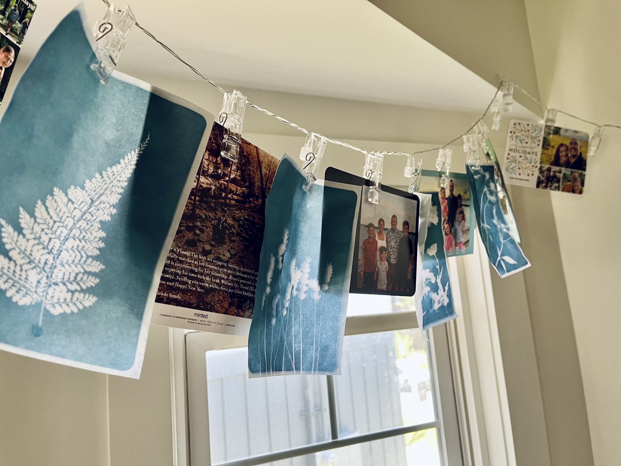
and yes, I do happen to keep my holiday cards I get from friends up throughout the year
What Didn’t Work
Bulky 3D objects. I tried a small pine cone and it was a mess, the edges were blurry because the paper couldn’t make contact. Stick to flat things, or objects you can press very flat.
Be careful with those sheets. I definitely made the mistake of pulling out a couple of sun paper sheets that were stuck together, and I didn’t notice until I was in the rinse stage. Made for an interesting experiment in sun exposure, but I was bummed to waste that second sheet.
Not protecting the paper. Come up with your design first, and keep everything in the dark sleeve until you’re fully ready to go.
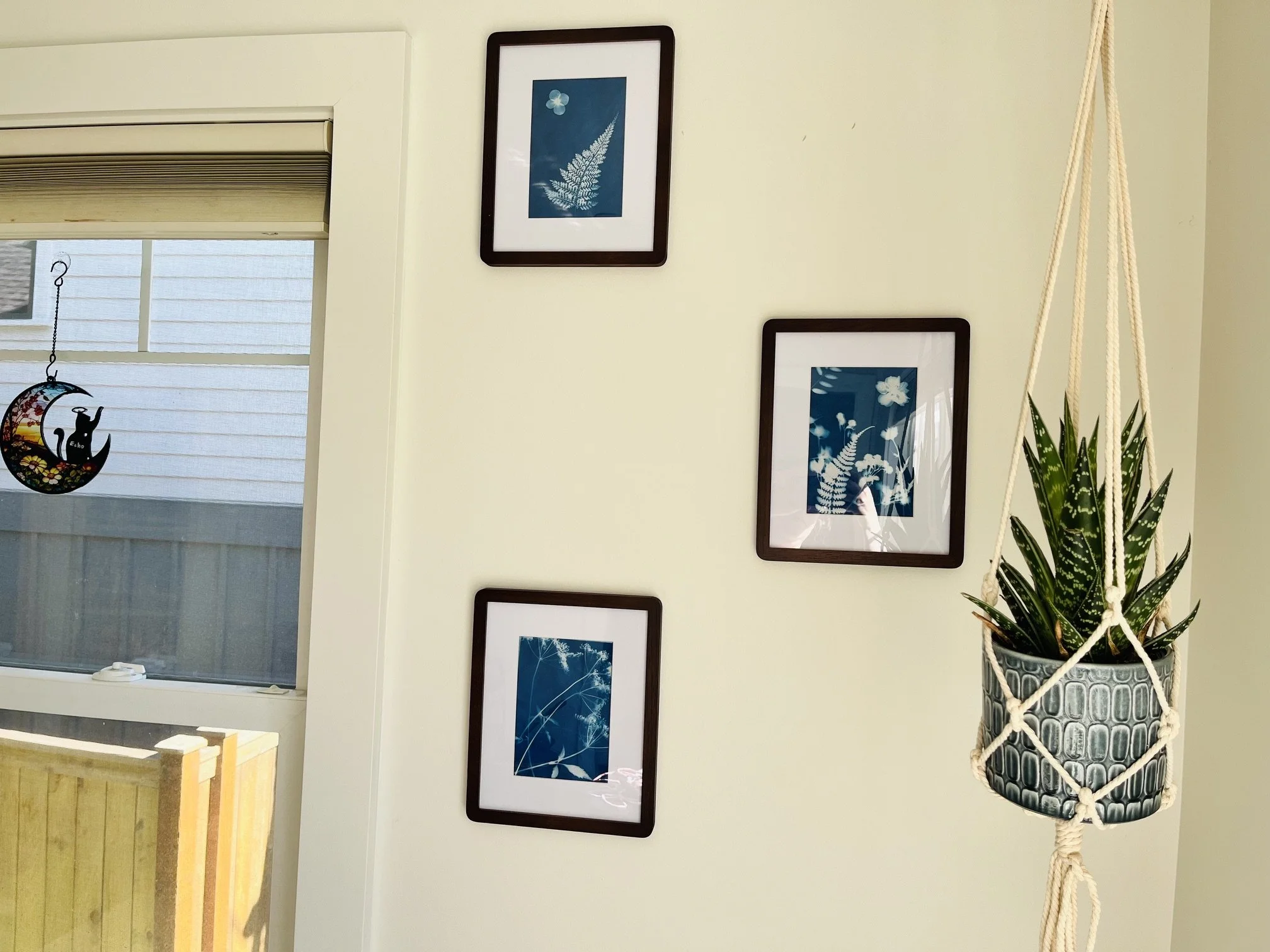
The Ones I Framed
Picking three out of everything I made was harder than I expected. Two of them were made with the pressed flowers, they really came out the clearest. The third was from some flowers I’d cut from the yard, something that flattened easily enough to get a clean edge. I ended up choosing based on which ones had the clearest silhouettes and the deepest color, and what just felt interesting to me.
I put them in simple wooden frames, and they look beautiful together! Something between art print and pressed botanical, with this ghost-image quality that feels old and a little wild. Very much the aesthetic I was going for. I might continue to experiment with this and just swap out new and different images I create, or have the kids make some and put those in the frames instead!
The kit I used is linked above, which I think is great for beginners. For the botanicals, I’d honestly just start in your yard or on a walk. A week or two in a flower press (or between the pages of a heavy book) and you’ll have everything you need. If you want to go deeper into cyanotype as a practice, there’s a whole world of it: coating your own paper, printing on fabric, doing photographic negatives. But for a first time? Sun, paper, something flat and beautiful. One small beautiful thing at a time!